
Have dashboards done their dash?
- Apr 9, 2024
- 7 min read
Enabling Management with Proven Views of Data
There is an increasing trend in business to stop producing regular reports and instead provide management with “dashboards” that have unlimited views of a range of data. In theory, all the data they need is at management’s fingertips, but we see an increasing trend that management is drowning in this sea of data rather than having insights to drive the business and performance.
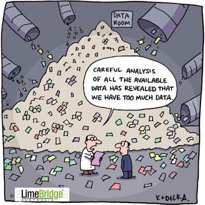
This democratisation and distribution of data can create several problems. Firstly, management has to have time to explore the data and obtain what they need. Secondly, management has to have the capability to create the views and snapshots that provide them with the right perspectives. Thirdly, the dashboards themselves may have limited formatting options such as a series of one off “snapshots” which make it time consuming to understand things like trends and annualised or monthly comparisons. Lastly, often there are multiple dashboards in different systems and parts of the business that are “isolated” from one another when they need to be linked to provide an integrated picture of performance.
It is as if the data teams have outsourced producing business insights to the management team and said; “there is the data, now do with it what you like”. This could have the reverse outcome of all areas of the business needing a data specialist to understand their data – exactly what the data teams were set up for in the first place!
Let’s look at a recent example that illustrates the need to understand the full picture and context.
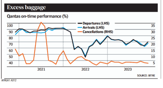
The chart labelled “Excess baggage” was published recently in a financial paper.
It shows that in 2022 and 2023 Qantas on time performance degraded compared to 2021 and tried to suggest performance had got worse.
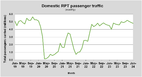
However, the dataset on Domestic passenger traffic puts the whole previous chart in a different context (source BTRE) and shows the dramatic difference between number of flights in 2021 and 2022-3. 2021 was a Covid year where flight volumes were 50-60% lower than 2022 and 2023. With so few planes flying, airports weren’t congested, spare planes were plentiful and Qantas and other airlines had plenty of available crew. Therefore 2021 was not a year you could use as a benchmark. This example illustrates the difficulty in picking the right data and interpreting it correctly. On face value the Excess baggage chart appears to show a problem but linking with a second data set provides a very different conclusion.
In the remainder of this paper, we’ll explore three key techniques to help management make more sense of the new sea of data and enable more valid actions and insight by looking at three things:
1. Understanding and insisting on trends (getting trendy)
2. Normalising correctly (the “what else is going on?” test)
3. The power of combining datasets
Taking each in turn.
1. Getting trendy – the power of trend analysis
Taking decisions based on one-off snapshots of data can be dangerous. Decisions based on one period’s data in isolation can lead to knee jerk reactions or a false understanding of real business trends. It is therefore critical to set up time series reporting which provides context for the results achieved today, in addition to dashboard views with one-off snapshots. (Often, you can use dashboards to get trends but only by running a series of snapshots and collating the results! It’s like trying to piece together a jigsaw).

In contrast, well-constructed trend data paints a picture of the direction of the trend and helps understand recurring patterns, seasonality or year-on-year trends. The chart on Total call volumes illustrates the data over three years and enables monthly comparisons. Using this data management can understand which way calls are heading overall and the relative size of each month or the annual peak compared to previous years.
Trend understanding is equally important to manage individual performance. A staff member may have had a single good or bad day yesterday, but understanding the trend in that performance data provides far more insight for any coaching conversation. Often, we see team leaders with daily, weekly and monthly views, but none of it “trended”. Their understanding of trend depends on what they can remember about the week to date or last month.

Trend pictures can take many forms that help understanding patterns. Heat maps (see picture) are another form of trend illustration. In this example, service levels for an operation are shown by half hour intervals for a week using colour coding to illustrate performance. Two different “trends” start to emerge.
Firstly, this illustrates the unbalanced nature of the week where the last two days are far easier to manage than busy Mondays. Secondly, there are frequent problems at the start and end of day regardless of the day of week. Once the patterns and trends are clear, management can go to work to construct appropriate solutions.
2. Normalising and the “What is really going on?” test
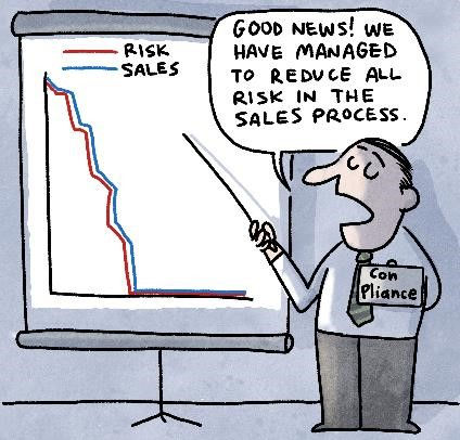
There is a risk that “dashboards” look at one set of data in isolation from others in the business, which may lead to the wrong conclusions. Some sets of data need to be “normalised” against others for them to be properly understood. For example, complaints in an organisation may be rising but if the business is growing at a faster rate than complaints, this may represent a “positive story”. Normalising against other macro trends in the business such as the trend in sales shown in the cartoon may be crucial to understand the real trend.
In “The Frictionless Organisation” and our paper on “Understanding Friction”, it’s valuable to think of contacts and complaints normalised against indicators of business volumes. Examples we have used include complaints per account (banking and insurance), contacts per subscriber (mobiles) and Calls per 1000 passenger trips flown (airlines). We call these metrics “Cpx” or contacts per X.
They also provide a valuable way to benchmark a business. In the early days of Amazon, contacts per order was seen as a crucial measure of their “ease of doing business” for customers. For them it was the ultimate measure of customer effort as they aspired to be a contactless organisation and recognised that every contact represented some form of effort. It was a metric that remained accurate even in a business growing 20-30% a year. Showing normalised data on contacts as a trend paints a clear picture of whether the organisation is getting easier for its customers.
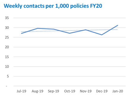
The insurance example above (contacts/1000 policies) was static over a year whilst the Telco business tracking weekly contacts/100 customers was clearly improving.

The latter was growing rapidly so the absolute contact volume was rising and “masking” this real improvement.
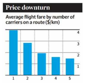
Another example of insightful normalisation is this chart showing the price paid per kilometre of travel on different air routes. It uses normalised data to show that the price paid declines as more airlines compete for any given route and takes away the issue of the length of
the route by using the $/km ratio.
A great example of normalising to make sense of what otherwise would be hard to understand data.
3. The power of combining
The best dashboards help “combine” data to provide greater insight. For example, cost and revenue often need to be analysed together. Revenue growth achieved through higher costs is not always a recipe for success and equally cost reduction may have a negative revenue impact.
In managing performance, we recommend looking at quality and productivity together to really understand individual performance.

Our US colleagues often use this two-by-two format that combines quality and productivity performance (individuals here shown as numbers). By segmenting on two dimensions the management and coaching strategies that may be required become far clearer. For example, the “stars” are those who succeed on quality and productivity and who may need to be rewarded. The “short cutters” quadrant may be productive but run other risks for the business and need coaching and training on how to do the work. Each quadrant lends itself to different strategies, but it is the combining of data that makes this clear.
Other formats combine multiple concepts in one layout. For example, in the view of drivers of contact below there is a combination of normalised data and trend to enable greater insight. For each contact reason, the small colour bars show a six week “trend” that helps management understand which contacts are changing and in what direction.

However, the whole chart has been normalised against the overall business volumes so that the business can assess if it is getting easier or harder to deal with for customers. The one chart allows the business to understand micro and macro trends and compare what is happening with different contact drivers. We often refine this further by adding information on costs and adding indicators of targets or “this time last year”. This illustrates the importance of picking the right format for the data and representing it in ways that make it more insightful.
A final example shows how data classification can help make data more actionable. This example uses a two-by-two format called a Value/Irritant framework.

In this framework the different drivers of customer interaction have been pre-classified based on their value for the customer or organisation. This places each data item into one of four categories each of which suggest a different action. This kind of analysis therefore combines categorising the data before representing it. In this example, a further calculation has calculated the workload (not just the volume) associated with each category of contact and also identified whether self-service already exists for this function (shown in red). The resulting representation triggers discussion on whether the proposed strategy (the quadrant), is correct and on the priorities given the sequencing from largest to smallest. Modern chart formats now enable the quadrants to be “scaled” to more clearly represent the size of the prize. This is a further illustration of the importance of representing the data in ways that make it more intelligible and combine different types of analysis.
The proof of the pudding with all this analysis, is the action and improvement that it drives. All the formats we have shown here have led to some action at different levels from changed channel strategies at the macro level to improved coaching and performance management at the team level. The use and representation of the data has enabled management to do its job and take decisions and drive change rather than spend time down in the weeds of data extraction and selection. While we love a good dashboard, we think they can be complemented with extra views of the data to produce insightful visualisation that are essential for good management. Wasn't that the point of data analysis in the first place?
Summary
In this paper, we hope we have explained the value of representing data in ways that can drive action and decision making on a regular basis. There are some amazing tools and tricks available and far more detail than we could include here. If you would like to discuss this further, please feel free to get in touch at info@limebridge.com.au or call 03 9499 3550 or 0438 652 396.


At Khelraja, we take your gaming journey to the next level with casino score—a fun and rewarding way to track your progress. As a premium online platform for casino, betting, and lottery, Khelraja offers exciting games, live tables, and bonuses that help you improve your score with every play. Play smart, win more, and climb the leaderboard. With Khelraja, every spin, bet, and hand brings you closer to new rewards.
New releases are added daily to SteamUnlocked for your enjoyment.
If you love free games, SteamUnlocked should be your homepage.
Many adult enthusiasts follow the careers of the hottest pornstars for their confidence, performance, and allure. These personalities set trends in the industry, admired for their boldness and creativity. They often build loyal fan bases with charisma on and off camera. Their popularity reflects how modern adult entertainment thrives on personality, passion, and captivating visual experiences.
GrowthWonders offers a practical and career-focused Growth Marketing Course designed for students, professionals, and entrepreneurs who want to master modern digital strategies. Our course covers SEO, social media marketing, paid advertising, content creation, analytics, and performance-driven campaigns that fuel real business growth. At GrowthWonders, we believe in hands-on learning, so every participant works on live projects and case studies to gain real-world exposure. With expert mentors, updated curriculum, and personalized guidance, we ensure learners build industry-ready skills that make them confident in the digital space.